Feedback
Feedback is an investigation into how users interacted with a simple device when provided audio, visual, and audiovisual feedback. See the final product.
Audiovisual, Data Visualization, User Testing
2011
Ableton Live, After Effects, Illustrator, QuNeo 3D, HTML/CSS/jQuery, MIDI
Interactive Data Visualization
Background
The purpose of Feedback was to measure, analyze, and display recorded information surrounding the use of a simple, one-button MIDI device. As a thesis building block, I wanted to demonstrate that the inclusion of audio could increase user engagement with a tactile product. The aim of the project was to produce a data visualization illustrating my findings.
Problem Statement
How do visual feedback, audio feedback, and combined audiovisual feedback impact a user's interactivity with a simple device? How can I illustrate this visually?
Research
Sensory Congruance
Studies and writings have shown possible benefits of connections between human sensory systems. In 2006, Bulkin and Groh wrote that "Interactions between sensory systems can offer numerous benefits for the accuracy and completeness of the perception." Lee wrote in 1995 that, "...it appears that when information is presented across channels, it should be highly correlated to improve learning and avoid inter-channel interference." In 2004, Calvert, Spence, and Stein wrote about the McGurk effect, which suggests that "The visual information a person gets from seeing a person speak changes the way they hear the sound."
Information from these sources and more gave me a hunch that it may also apply to a user interacting with a tactile device. But I needed a simple way to show this.
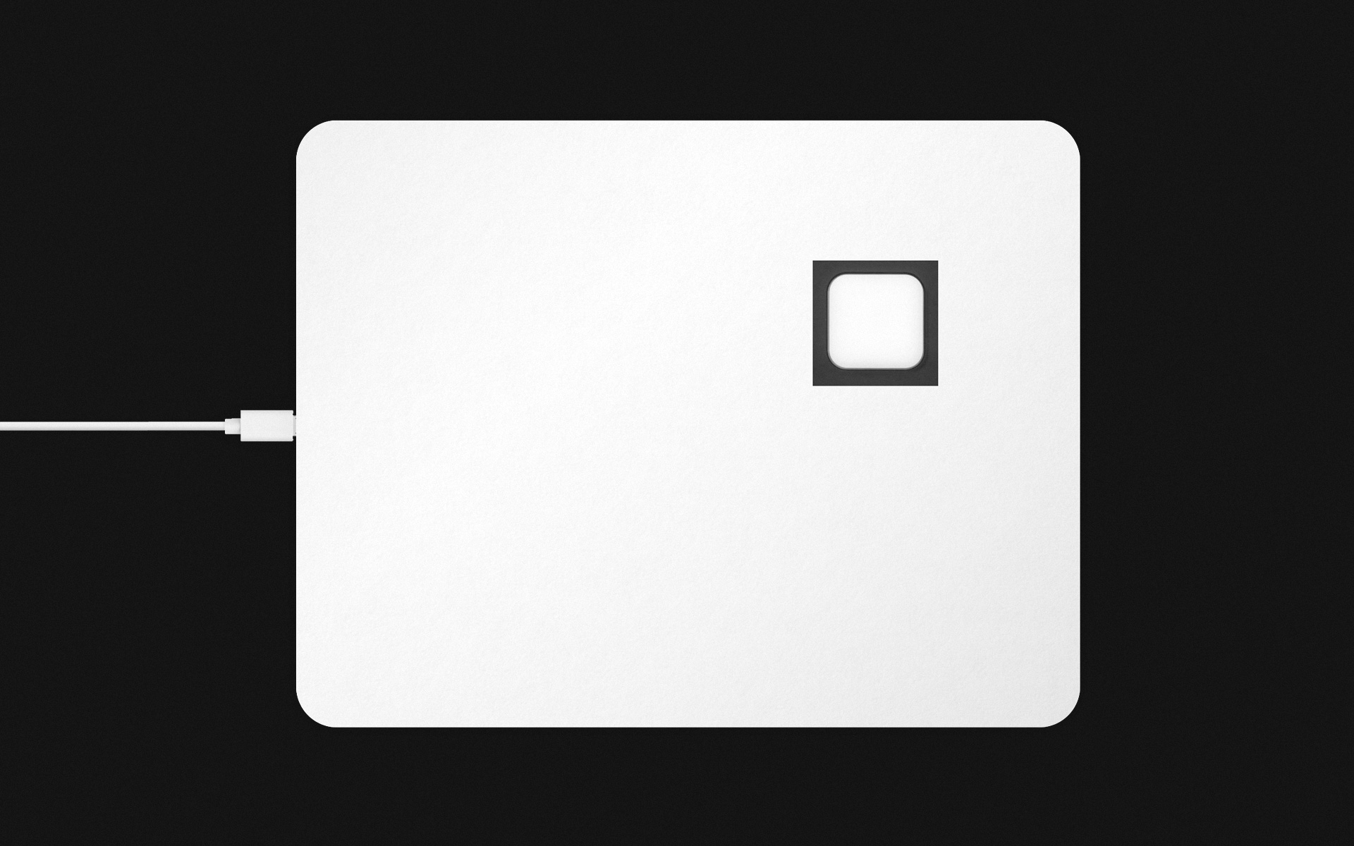
Finding a Device
I needed a way for users to interact with a physical object in an extremely basic fashion, and I needed a way to record these interactions. With too many bells and whistles, a device's extraneous features could become distracting and muddy the testing results. I had a MIDI pad instrument on hand, but there were way too many buttons! Covering all the extra buttons allowed me to utilize a single button of this robust measurement tool in a very simple and straightforward way.
Finding a Color and Sound Scale
Using Neil Harbisson's Sonochromatic Music Scale, I assigned the velocity of button presses to colors and sounds. This scale was an ideal to use, as not many color/sound equivalency scales were as pervasive at the time. I later used the same scale on my ColorSynth experiment.
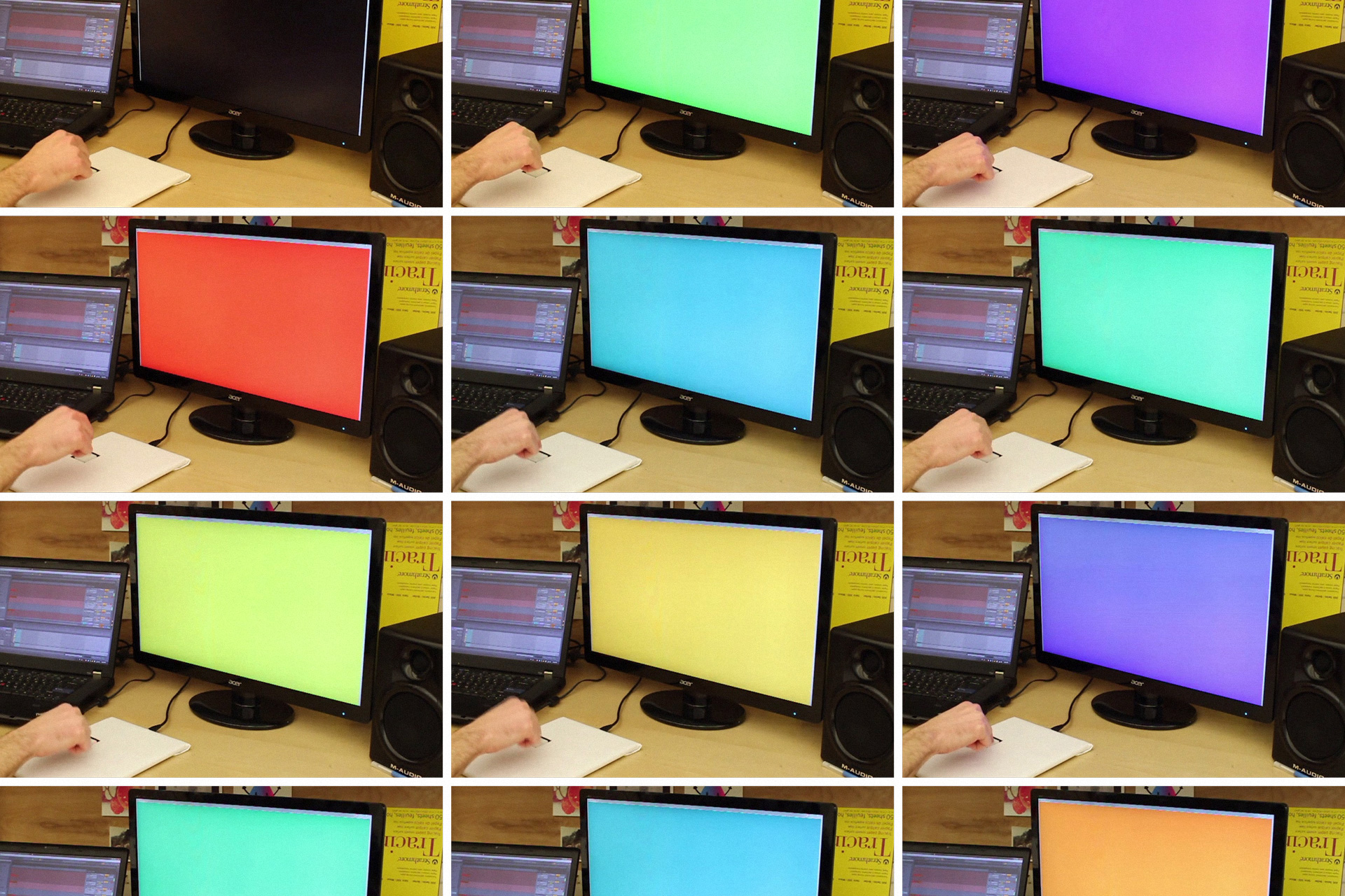
Testing Setup and Tactile Device
Data Collection
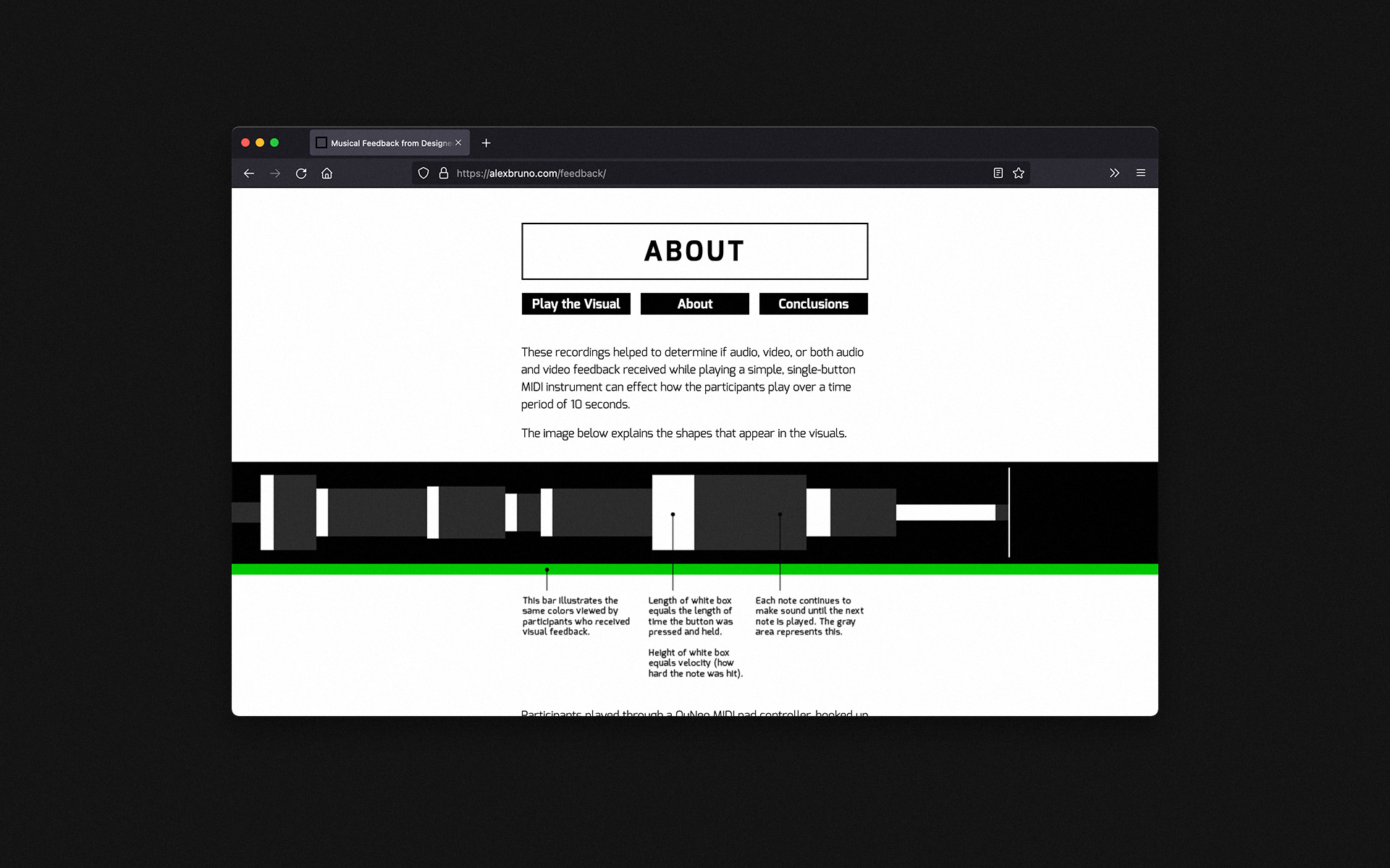
Users were sat at a desk, one at a time, and were given a simple, one-button device. The button recorded each press, as well as the duration of the press, and the velocity (hardness) of the press. Also on the desk was a computer monitor and speakers.
Users were divided into three testing groups:
- Those who received audio feedback only (sounds from the speakers based upon the velocity of a button press)
- Those who received visual feedback only (colors on the screen also based upon button press velocity)
- Those who received combined audio and visual feedback (sound and color that changed based upon button press velocity)
Interactive Data Visualization
Users were instructed to press the button as much or as little as they wanted. Low velocity presses triggered lower, constant tones of sound and cool colors flooded the screen. High velocity presses triggered high constant tones and warm colors. Users had ten seconds to play with the device. The ten seconds of interaction were analyzed and quantified.
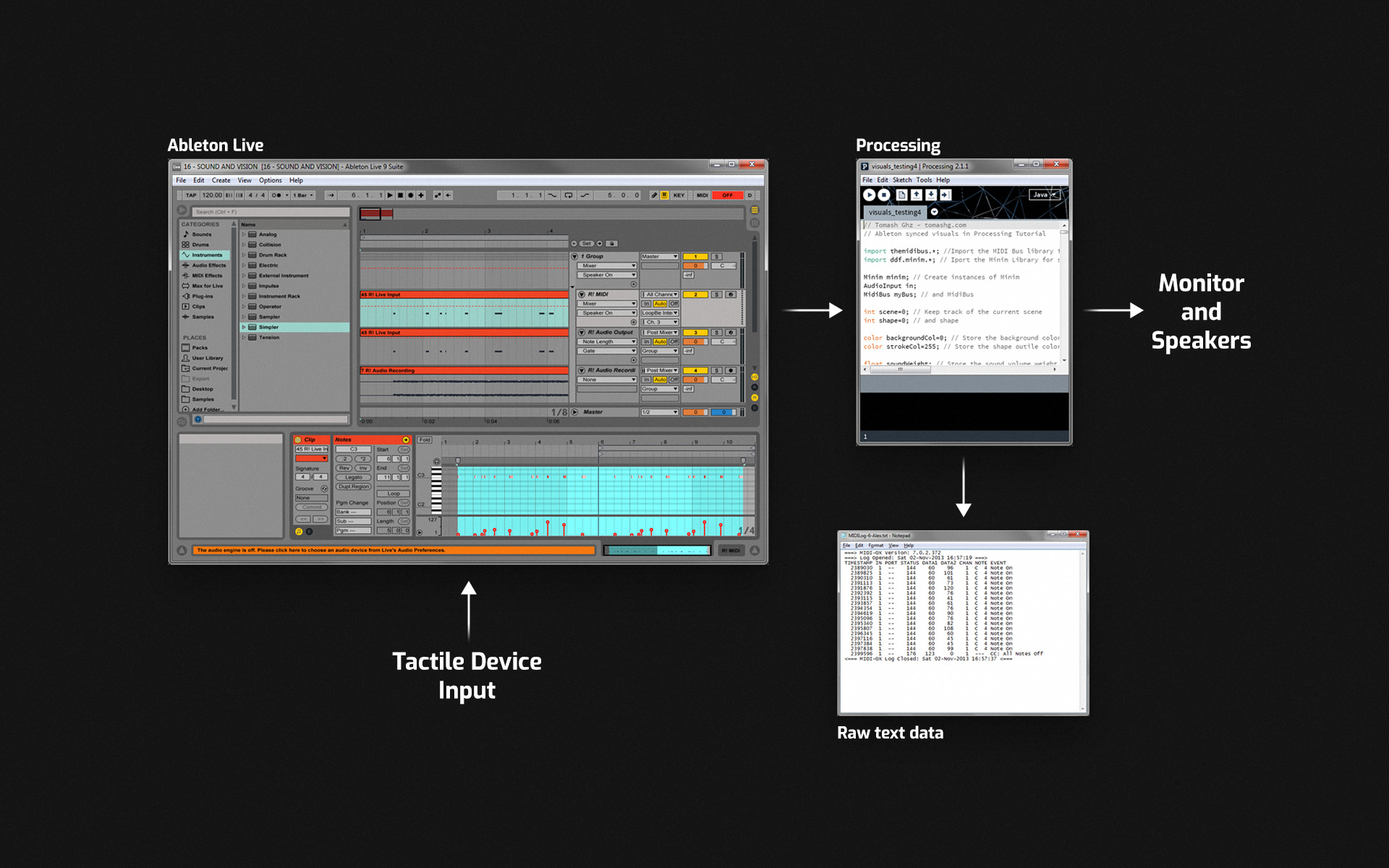
Data Collection Path
Results
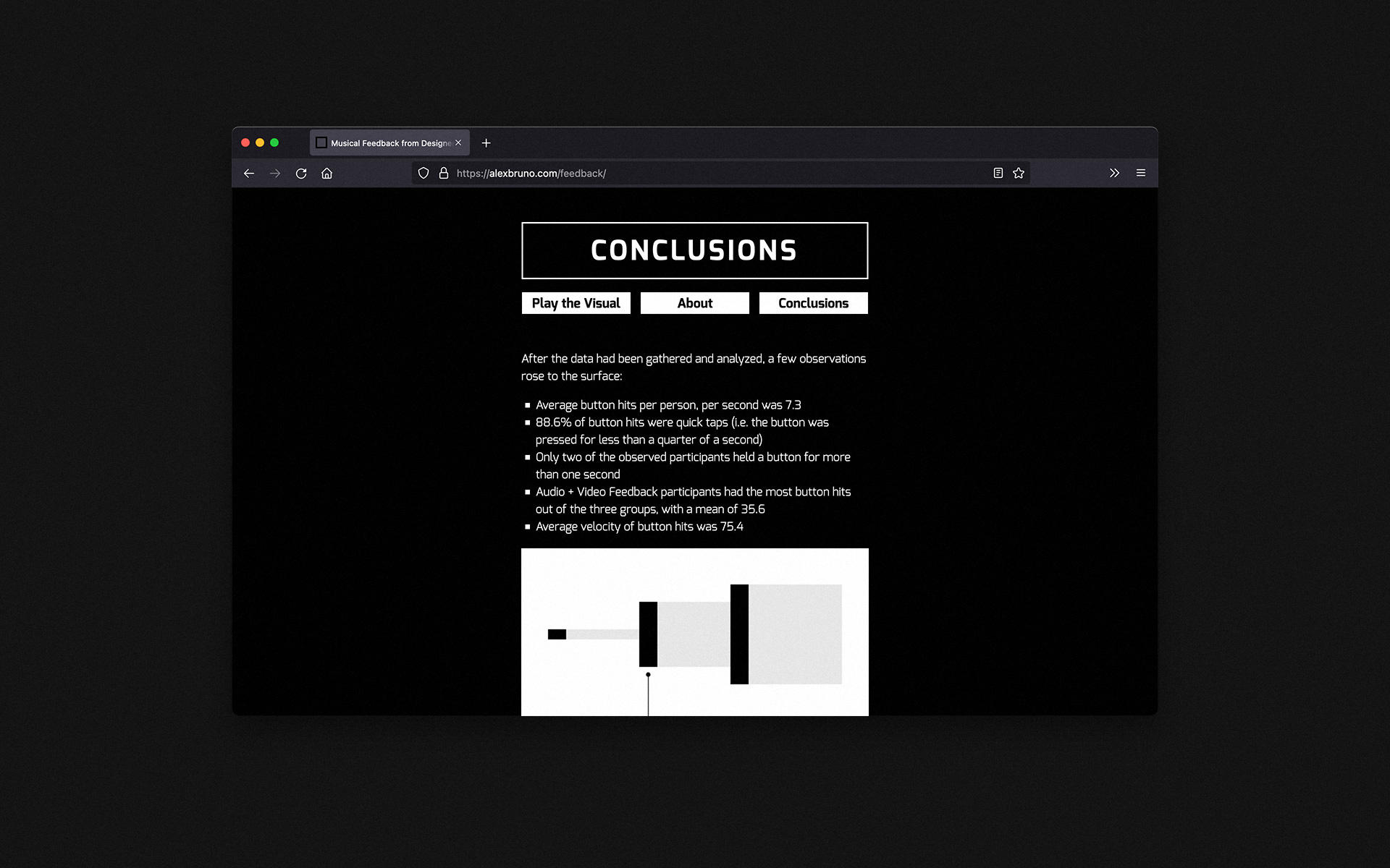
Comparing plotted data side-by-side on a timeline revealed that users who received both visual and audio feedback played most dynamically with a mean of 35.6 presses over ten seconds. Users who received audio-only feedback played the least dynamically, and users who only received video fell in between. The average velocity of button hits was 75.4 (within a range of 0–127).
I wanted to create an engaging data visualization that allowed viewers to experience what the participants were seeing and hearing as they were tested.
The end product was an interactive data visualization that allowed viewers to observe trends across all participants' timelines. It also allowed viewers to experience a single timeline in greater detail, simply by hovering their mouse over it.
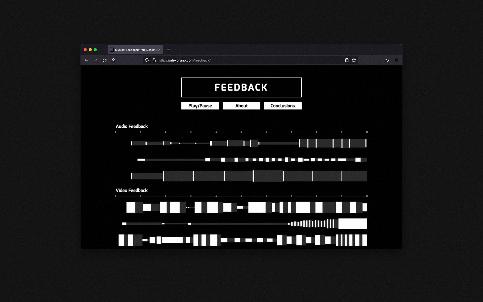
Final Website
Conclusion & Learnings
Interact with the data visualization on the Feedback website.
The data indicated that users who received combined audiovisual feedback were the most engaged with the tactile MIDI device. They interacted with this very simple instrument in the most dynamic way of all the groups tested.
This knowledge empowered me to continue down the path of utilizing audio in my visual compositions. Additionally, the plotted data created an impactful design artifact which clearly showed the findings.
In the future, it'd be beneficial to test and analyze data from even more people. Approximately 21 people went through testing for this project, but due to time constraints, I randomly chose three from each group and analyzed only these individuals' data. I also think it would be interesting to invert the Sonochromatic Color Scale and see if the results were similar.